
Logo Police Reporting for Duty (Post-Retirement Edition)
Never Expected There to be a Time Machine at the Le Meridien Fort Lauderdale Airport

We already covered our completely and totally fine experience on Allegiant for last week’s post, and we were ready to move along to our regular snarky airline commentary, but we just couldn’t get something else from that trip out of our head. It was something that triggered deep memories of our early time in the business the same way that biting into the ratatouille makes Anton the food critic cry in, well, Ratatouille.
We’re of course talking about the Flight Information Display at the Le Meridien Fort Lauderdale Airport in beautiful Dania Beach, FL.1 2 Why would you guess anything else?
Seriously, though, why would a “blink and you miss it” information screen that is essentially obsolete in the days of the smartphone cause such an emotional impact?
That’s because we’ve never seen such a collection of antiquated airline logos in a contemporary setting — a virtual graveyard of identities (and memories).3 There are airline memorabilia conventions that don’t have this much esoterica going on.
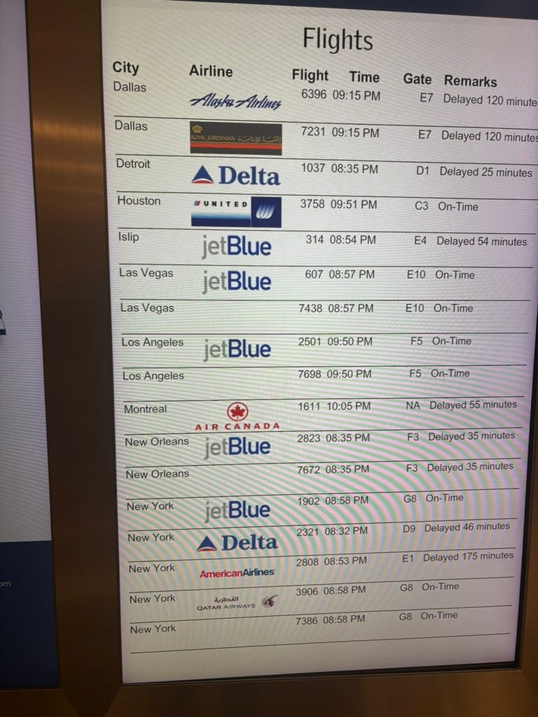
And, as former “logo cops,” we couldn’t stop staring at them.4 Hotel staff and guests kept wondering if we were lost or needed medical attention (or both). No, we were just reliving our past as we contemplated each and every line on this screen.
Dream #1: The Delta Curvy Widget5
We worked (A LOT) on this project way back in 2000.6 We were young, just getting started in the business, and thinking we were doing cool stuff. Once we joined on at DL, we learned that it was one of the most unpopular decisions in company history, and it was part of our job to make people still use it … fun! There’s a reason that DL went back to the original widget just a couple years later. We also loved that the flight was going to CVG, perhaps back to the hub it used to be …

Dream #2: American the Way it Should Be
There have been so many crimes against airline branding over the years (see above), but few are worse than what American did back in 2013 when it refreshed its whole look and feel. We worked with people close to the situation and got the full read-out on why it was done, but to quote two famous professional wrestlers:
“We don’t care.”
Yes, planes are not made of (mostly) metal anymore, and yes AA’s old brand palette might not have worked as well in the new digital age, and yes they had just merged with US Airways, but man, there still has not been a cooler plane than a polished-up AA DC-10.7 Unspaced Helvetica for life.

Dream #3: Sweet Home Chicago
Our sweet old place was at UA HQ when the tulip logo was in full bloom post-bankruptcy, even gracing the top of 77 West Wacker Drive in The Loop. Once again, we’ve already made it clear how we felt about the move away from the tulip post-Continental merger a few years later.
But, we got to see our beloved Saul Bass-designed tulip in Fort Lauderdale not once, but twice, in a lock-up that we’re pretty sure would have been completely against the brand rules back in 2007.8 We weren’t logo cops back in Chicago like we were in Atlanta, but man, we wish we could have been.

Dream #4: Southwest Used to be Clunky (and We Loved It)
Seeing that Southwest Airlines wordmark, plane clip art and “A Symbol of Freedom” tagline squeezed almost illegibly into that tiny space made us smile. It also reminded us of peanuts (not snack mix), Wild Turkey, and open seating. It seems we can’t go more than a week or so without pining for Southwest the way it used to be, even if we’re in a hotel lobby and not even flying them this trip.

We could go on and on here with these screens. We hope you’re not flying “LAN” because they retired that name over a decade ago. Some of the other codeshare flight lines didn’t even have airlines — kudos to whoever in the revenue management department pulled that off — we assume you don’t have to share revenue with an airline that doesn’t exist.
We will say that airlines’ focus on branding has improved so much since the days when we were trying to convince West Palm Beach airport staff to update their gate signage.9 (Almost) everything we see across the board is better designed and consistent — our pining for some of the past’s greatest hits aside. But, every once in a while, something like this magical screen reminds you that one must be vigilant everywhere! The logo ghosts never die.
Notes
Not far from the now mostly empty Spirit HQ, once again RIP
These displays are known as FIDs, while the ones at gate are known as GIDs — people at airline headquarters are always talking about their GIDs and FIDs
When we worked at the logo company we were always taught not to call them logos — of course everyone still did anyway
Every company has some version of a logo cop, and at an airline the logo cop is looked upon with incredible respect and esteem — this is not true
The DL logo is affectionately referred to as the “widget” and since there are dozens literally welded into the wrought-iron fence surrounding their corporate HQ, maybe changing it wasn’t the best idea
Long-form piece coming on this whole adventure, soon
The AA rebranding made as much sense on paper as any effort does, but the heart wants what the heart wants — and it wants this plane
Literally used to have books with brand rules in them that were summarily ignored by many — things are more consistent now, probably because you don’t have to check a book
They did not
Next up, please address the lag between new livery launch and final plane being painted in that new livery (and given the sheer number of Air Canada “toothpaste tube” liveries still taxiing around YYZ 10 yrs (I think?) post launch, they might win?)